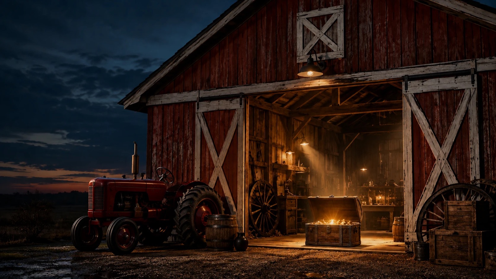
A strong photograph or artwork can suggest a coherent direction because its color, light, rhythm, and subject already belong together. Look at how those qualities work together so you can use them beyond the original image. A dark vertical against a warm field might inform contrast and spacing; a quiet texture might suggest restraint. Try those choices in a design and check that they suit the organization’s purpose. A compelling image does not automatically provide a complete identity, and it does not authorize changing an existing approved logo to match a new composition.
Translate a few useful visual relationships.
A photograph of a weathered building might offer a warm neutral palette, a strong vertical rhythm, and a sense of place. Those qualities can inform a page without turning every surface into a copy of the photograph. The photograph suggests an approach that the design can adapt to different pages. The weathered-building photograph could inform warm background tones and deliberate vertical alignment while the text remains clear and contemporary. A page explaining a service would use those relationships without decorating every paragraph with brick texture. The design would still need to show whose service it is and what the reader can do.
Choose the image for its relationship to the people and purpose of the work. Then test the system on a small label, a wide screen, and a page of text. Preserve any existing brand mark in its approved form; adapt the surrounding composition to support it. A design can retain the source image’s distinctive character by using a few well-chosen qualities. Remove a borrowed element when it competes with meaning.
Put it into practice.
Write down the qualities that matter in the source image and why they fit the work. Translate a small number into rules for color, contrast, spacing, or framing. Test those rules on a text-heavy page, a small identification, and a wide image treatment. Keep the original brand marks intact. If the system only works when the source image is enormous, refine the rules so the identity still communicates at ordinary sizes.
What is already distinctive in the material you own?